Friday, June 10, 2011
appropriate cutlery
I don't know how I could work this in but I am loving the individuality of the cutlery mobile in this kitchen! I love originality!

Monday, May 30, 2011
singular art
A single colour canvas is surprisingly very interesting. It draws out the colour in the room - really draws your eye to it.


too cool for school
I can just imagine guests at the wall trying to find all the words in the find-a-word! It would be classic!!! LOVE IT! Come to think of it...I might just make one myself! Very personalised art indeed!!!!


stocking up on the important things...
I bought a cushion... and I LOVE IT!
It completely fits in with our bright colour, lil bit retro theme we have in our heads!! The green is vibrant and the pic just not do it justice!

It completely fits in with our bright colour, lil bit retro theme we have in our heads!! The green is vibrant and the pic just not do it justice!

Monday, January 31, 2011
spying is ok when its posted free for all
Ok, so I have been stalking some blogs of people that are building with Eden Brae - we all pick from the same home gallery etc - so I thought it would be worth it...
It seems browns and greys are big. Grey it seems is the safer option for floors with people. It annoys me that brown is happening because I don't want to be like everyone else... oh well - we will go with what works...
It seems like feature tiling the wall hidey-hole is popular with alanamareeshome


The brown bathroom does work with edenbraebuild - although I would have a brown timber-look cupboard - not black. Love the white tile on the bath. Qyite like the aluminium edge along the bath. It matches nicely with the aluminium taps etc. The rectangular shape wotrks well. I completely see us with a white bench. Perfect.


Loving the dark floor, light cupboards, brown benchtop. Nice...

It seems browns and greys are big. Grey it seems is the safer option for floors with people. It annoys me that brown is happening because I don't want to be like everyone else... oh well - we will go with what works...
It seems like feature tiling the wall hidey-hole is popular with alanamareeshome

Good style one sec - gone the rest... Not a fan of the feature tile. Definately not a fan on the strip. They tiled normally in the wall hidey-hole. Looking at it - I think it needs to be a smaller tile. The bigger tile looks goofy.

I looked through the blog - these benches aren't Caesar or Essa Stone - they are laminate - but the colour is similar to our choice - ours might be a little lighter... I like the light cupboard doors/brown bench combo. The colour picked for the cupboards was natural - I suppose because the paint is Hogsbristle or something like that. Since we are going white walls - white would probably be best? We will have to check with the home gallery...

Loving the dark floor, light cupboards, brown benchtop. Nice...

the ooh la la of homes
Thank you Desire to Inspire for bringing me my daily fix!
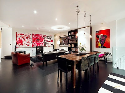
Check out this house! I am so feeling us in here! The floors are dark and the walls are white (yes, they are black floors - but if black and white works - then brown and white will work!) and it has an apartment-vibe which I love! Apartments are generally much smaller than houses so they really make use of space!
I am loving the dark floor - white wall combo.
Loving the use of aluminium in the kitchen - we won't do the bench - but a splashback that matches the floor is something to think about.

We need ceiling fans because we are going without air-con - hail to the electrical gods! When you think of ceiling fans - they don't make you think 'modern' but I love the look in this room! Dark floors, white walls, black window frames, asian vibe and an aluminium ceiling fan - LOVE LOVE!


I LOVE the bright as a button art on the stark white walls. It looks so impressively modern and brightens the room! The exposed cord hanging lights over the dining room are also amazing, but I know I will never get that through Mr Piggy! For one, we would have to pay for 3 x light fittings and secondly - it looks unfinished and he isn't too fussed on that...


Check out this house! I am so feeling us in here! The floors are dark and the walls are white (yes, they are black floors - but if black and white works - then brown and white will work!) and it has an apartment-vibe which I love! Apartments are generally much smaller than houses so they really make use of space!
I am loving the dark floor - white wall combo.
Loving the use of aluminium in the kitchen - we won't do the bench - but a splashback that matches the floor is something to think about.

We need ceiling fans because we are going without air-con - hail to the electrical gods! When you think of ceiling fans - they don't make you think 'modern' but I love the look in this room! Dark floors, white walls, black window frames, asian vibe and an aluminium ceiling fan - LOVE LOVE!
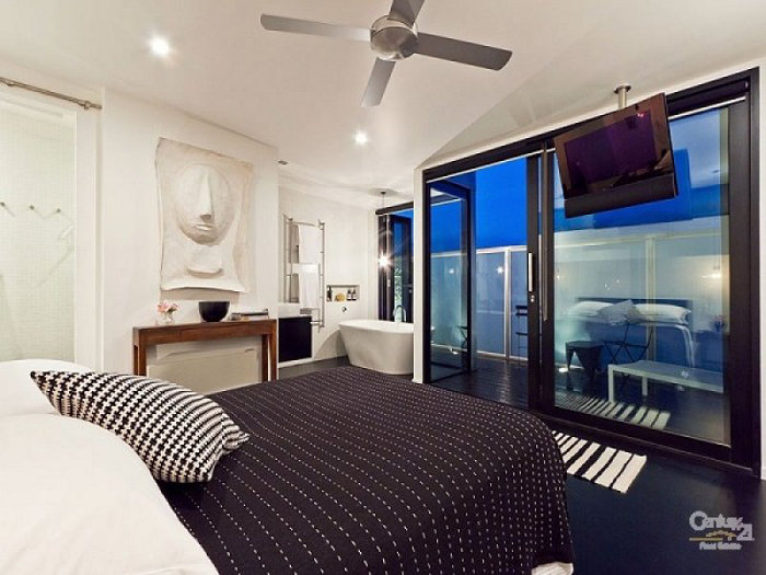
Loving the asian vibe! I am also thinking twice about the shower wall hidey-hole - I am quite liking seeing it all in white! Admittantly the tile is quite small or it has a design, but I reallu love how clean the white is! I will have to find out if ours would have clean edges or if it would be edged in aluminium. I think I would be happy with either, but this is so minimal - LOVE IT! Maybe instead of a fussy tiny mosaic, we could get a small square white tile inlaid instead? or use the same type of tile throughout? Hmmm... interesting...

I LOVE the bright as a button art on the stark white walls. It looks so impressively modern and brightens the room! The exposed cord hanging lights over the dining room are also amazing, but I know I will never get that through Mr Piggy! For one, we would have to pay for 3 x light fittings and secondly - it looks unfinished and he isn't too fussed on that...


Black framed windows look amazing. It makes the windows look like you are gazing into pictures...

Subscribe to:
Posts (Atom)