On our travels adventure-ing through houses and housing concepts, we have come across some great ideas and inspiration...I just haven't gone to the effort of getting them all off my phone. So here is a big spew of thoughts!
Love the timber and openness of the bathroom. I love a wall of tiles instead of glass.
Shelving does not need to be conventional... loving the use of boxes stacked into shelves. There would be a risk of them all falling over I expect? =/
This is not my style, but I love the way that the lounges aren't pushed against the wall - they are drawn forward to make a cozier living space and cupboards are behind - you still have access but its a great space-saving idea!
Thought of the day: more and more I am seeing these larger rooms that are complete waste of space - there is so much space in the middle that you just aren't able to use. It makes no sense! Although you can justify it by saying that you plan to entertain, I much prefer the coziness of a smaller room.
I like the idea of a classy wine rack and using that extra space above the fridge is genius!
I am a big fan of that breakfast nook thing (of whatever you call it) - where you can push those appliances in easily that you use all the time - like the toaster! I HATE having to find room for the toaster!
Its spunky and a potential DIY!!
This is the Hazelmere 24 Clarendon home we loved. We hadn't really considered 4 bedrooms until we set our mind on it later - but this home only has one living area and the garage is on the same side as the alfresco, so it didn't work for us (with the land we were considering), but one thing we LOVED was the IT area. As you can see from the floorplan, it looks out onto the alfresco, it was so modern and had so much potential!!
I believe this is a Clarendon also. I loved the use of tones in this house! Instead of just sticking to one colour- two similar tones looked really good!
Instead of the same ol' 'this is a hallway', 'this is a doorway' etc. I really liked the Clarendon features - I like the features of doorways and hallways - they weren't just straight - they put a bit of thought into it. You might not really notice these things unless you make an effort to, but even if you don't nitice, I think it give the home a particular feeling that is really nice. Its interesting.
We were fond of this IT alcove. It was very open, but could be used for a lot of things, it could be an IT room/office, kids playroom, sanctuary etc.
I am obsessed with the fireplace, surrounded by lounges. It looks so cozy, even without the fire lit! But I think I would prefer a more modern, ethanol fireplace.
Ok, Mr Piggy liked this feature - not me. Its in a Clarendon two storey home. Its an internal balcony that looks down over the stairs. It reminded me of Romeo and Juliet and I ribbed him about it for the rest of the afternoon! :)
I love cement pavers that are used really well. These ones were surrounded by stones. No watering (like a garden) - hooray!
White or neutral coloured blinds are safe. I really enjoyed seeing these black venetians. They wouldn't be out of place with black framed windows and they looked very dramatic and classy.
What a pretty kitchen! I like the straight kitchens with the island in the middle - looking out over the room. I wouldn't put handles on the top cupboards though. I like sleek.
A coffee table is a bit of a must at some point, but I am loving this little cushiony centre-piece. You could put your feet on it from any lounge (and lots of people could share), you could use it as a chair, if needed and move it into another room. I love that it doesn't have to be the same fabric as the lounges! It looks great!!
Its not going to happen, but lets take a moment to gaze in awe at the size of this pantry... I know who would love this... my mum. I always say that she has enough food to keep us alive in the event of a nuclear holocost. Seriously - I have encouraged friends to come around if it ever happens, as she could feed a town!
These blinds look great - very modern and simple. I am in love with timber frames! Again, its not going to happen, but I can swoon...
I love the little island bath feature! I love straight lines and the extension of tiles around the bath. Simple but effective.
Ventilation windows - high enough to maintain privacy, can be opened for ventilation and can let in natural light. We are most likely to be going without air conditioning, so we would like to be able to ventilate the home where possible.
Love how the outdoor are is so close to the kitchen. I know we all say we are going to entertain, and I don't think it happens as much as we expect, but this really promotes togetherness, even if its just with a small family.
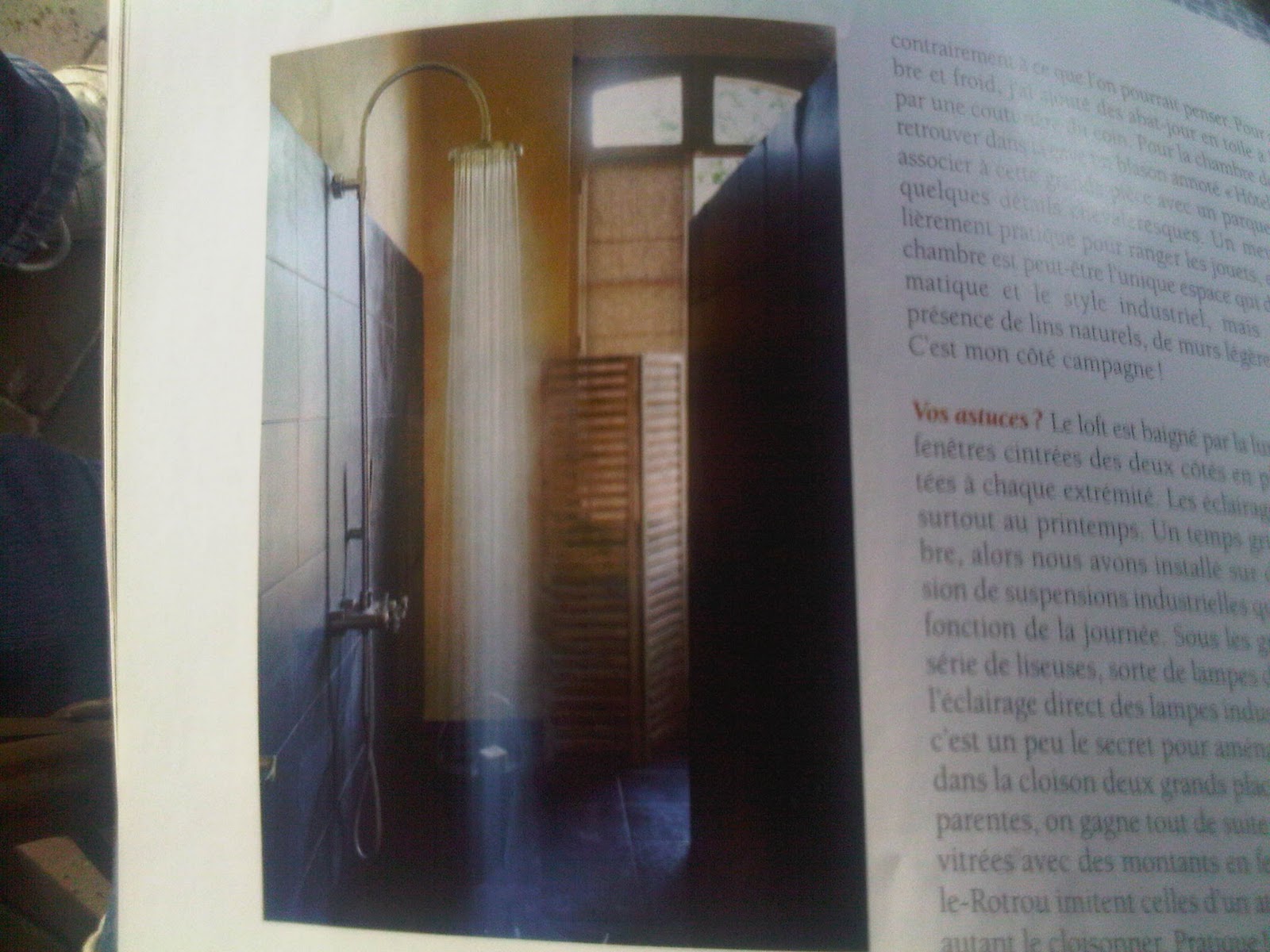
Feature tiles in the bathroom is nice. Also, a shower thats not built on a corner, but recessed into the wall. It seems a really good use of space.
Open bathrooms... I don't know how I feel about them. All I can imagine is the amount of steam invading the bedroom. It just doesn't seem right. And if you can always look into the bathroom, you would have to keep it really clean!! The only words that spring to mind when I see this is "sexy time". That is all..
Timber....ahhh...
Mr Piggy likes this tile feature in the floor. It looks like a little bit of outside has come inside. I would usually like that...but not this time...
It is with a heavy heart I post these photos. I am all for the asian influence. I love timber in the bathroom, the little shower stool, a low timber bed, rice paper screens, but Mr Piggly loves the asian influence and love everything about it! I love the idea of a red wall - I think you could do a lot with it - but this seems tacky.
Also, the funiture, maybe a couple as a feature, buit not everywhere... its just too much...
He loves this mirror...reminds him of a ninja star...
Floating shelving...love it. Its like the shelf itself becomes part of the art! It is known that if you can see the floor (instead of cupboards etc. extending to the floor, taking up space) the room appears bigger. I like that idea - looking around the room and being able to see the walls.
Ok, this is a more crazy idea. I saw this in a fashion magazine and got excited. Those colour eye tests - as art! I am sure people are already doing it...but I really like it. It would be modern and would have a medical reference about it, which I like (doing nursing and all). How sad am I? Next, I'll be hanging skeletons! haha
The dark wall. As much as homes are going light, neutral and airy, I love this dark feature wall which the TV sits on. It draws attention to the wall, like a cinema.
Again, the floating cupboards... see... they make a room look bigger when you can see the wall. They have lights below the cupboard which I find interesting...
The outdoor picnic table... it looks so olden day. Love it. But I think you would have this out in the elements, not undercover - and you would get a really cool umbrella!